Role (Group of 4):
Background
Challenge
We had to understand the needs of the contemporary grocery shopper and channel this knowledge to inform the design of a refined grocery shopping experience for the user. The design must maximize positive and fluid patterns of interaction.
Problem
Women (aged 35-50) in smaller, urban grocery stores need to be able to quickly and efficiently find specialty or obscure items without having to seek out an employee for help.
Solution
Our solution “Sophie” is a grocery store virtual assistant that allows you to ask where any item is located in the store. After asking the question, the device will show you the aisle and map you a path from your current location the item. This allows you to avoid the trouble of locating and asking store employees.
Research
To better understand our target users
Observation
We had one observation session at Fresh City Market, a local grocery store. Here are notable things we observed:
- Older demographics took their time going through each section and aisle of the store, used written lists, and purchased a cart full of items.
- Younger demographics were more likely to only grab a few items and not explore the store, knew what they wanted without a list, and would use the buffet or ready-to-eat areas for dinner.
- Most employees were only at the checkout area and not located throughout the store.
- There were sale items located at the end of each aisles; however, they did not correlate with what the sign above read and were randomly placed throughout the store with no real intentions.
- Shoppers would wander for a significant amount of time not being sure of where to find a specific item.
- There is no map letting customers know where categories of items can be found.
- There are two different refrigerated sections that confused customers who were looking for milk in one section but could not find it.
- Many shoppers would use their phone while in line for checkout.
- Aisle signs were confusing and not specific enough.
- Shoppers would spend a significantly more amount of time scanning shelves when they were not sure on which shelf the item would be located.
- Younger people were not seen asking employees questions.
- A couple older people (assumed 30-50) were seen asking employees questions.
- There are many items that are not staple foods. They are specialty/obscure items you would not find in the average store, especially for restricted diets.
Interviews
For our interviews we reached out to four shoppers to understand their habits while in the grocery store. We wanted to learn more about the trends and opinions shoppers have, and why they have them. We also wanted to understand what shoppers felt was a good experience versus a bad experience.
Questions:
We asked shoppers a variety of questions about their shopping habits, such as when they you shop, how often they shop, what their shopping journey looks like, if they make a list (handwritten, digital, or mental), if they use coupons (paper or digital), if they make impulse purchases, if they use loyalty cards, if they buy more brand or generic items, and if they use self-checkout. We also asked our interviewees on their opinions of grocery shopping, such as what aspects they enjoy about their favorite stores, what they are frustrated by when shopping, and how they feel about using technology while shopping.
After interviews, we sent out a Qualtrics survey to get a more broad view of our user. We received 32 responses and from that, we found some key points.
- 83% of respondents were female
- 43% were within the age range 35-50
- 60% go to the grocery store once a week
- 35% shop for 4 other people
- 45% shop at a smaller, local, grocery store chain
- 57% shop for 30 minutes – 1 hour
- 63% ask for help when they can’t find an item
Our survey results led us to focus on a Adult women aged, 35-50, in a smaller urban grocery store. To localize the solution, we decided to focus on Fresh City Market, located in West Lafayette, IN. We feel this embodies the type of stores our users are shopping at better than Walmart, Target, or Meijer could.
Insight
User Behavior
- Helpful sales assistants make for a better customer experience.
- People usually ask questions when they can’t find an item.
- People like self service kiosks, as they are seen as more convenient.
- People want technological assistants that are more human-like and conversational.
Affinity Diagram
After we researched we started an affinity diagram to get all of our research, interview, and any other into a visual format. We did this by putting each bit of information on an individual sticky note. We took these sticky notes and started to organize them based on similar characteristics. After organizing them out into different group we labeled them: payment problems, shopping enjoyment, angers, phone use, coupons, layout, impulse, list habits, time, proximity, and demographics. With these groups now formed we took specific categories like time, list habits, and demographics. With these we started to form our personas, while we took other groups like payment problems and angers to give motivations towards our prototypes.
Initial Sketches
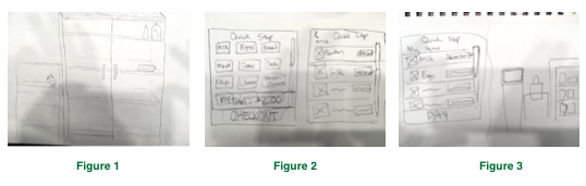
We first began our ideation with the concept of implementing a “Quick Stop” located at the front of the store. This would be made of a refrigerator and shelves that contained the most essential and staple items that almost every shopper purchases (Figure 1). This would allow shoppers to quickly grab the important items that they need and not spend time searching the store. With this, we included a self-checkout interface that would add onto the quick transaction of this entire experience (Figures 2 and 3).
However, we decided that this concept did not entirely solve our problem of shoppers not being able to find any item in the store. While it does help shoppers improve their efficiency and time management, not all items would be provided in this concept. Not only this, but shoppers can usually find their staple items that they purchase frequently. We decided to focus our design on the entire store experience rather than just the front of the store.
We then came up with the idea of creating a virtual grocery assistant. With the problem we decided to tackle of difficulty finding items as well as finding employees, we thought a virtual assistant that would help shoppers locate items and is always available for use would be very beneficial and would improve the shopping experience. With our research on virtual assistants, we believed that shoppers would respond positively to the implication of these interfaces in the store. Also in our research, we found that the rise of popularity of conversational interfaces would be interesting to incorporate into our design. The feature of speaking to the interface and hearing a response would allow the shopper to feel more natural about asking a question to an interface, as if they were speaking to an associate. We are not replacing employees, but rather allowing the shopper better and easier access to asking a quick question on where to find an item. The shopper would still be allowed to speak to an employee if wanted, but if there were none available at the time, the interface would always be an option.
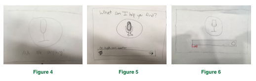
We came up with various different design layouts that we considered before we built our prototype. In Figures 4, 5, 6, we sketched varying layout screens of the interface that the user would initially see when using the device. All sketches include the icon of the microphone, indicating the user to speak towards the device. This icon is seen on many different platforms to indicate the user to speak, including iOS and Google. Some sketches also allow the user to type their question if they feel uncomfortable about speaking.
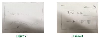
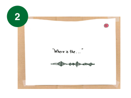
Figures 7 and 8 show two different design ideas of our listening page. The listening page serves as a feedback mechanism to allow the user to know that the voice assistant is listening to them. Figure 7 and Figure 8 both show the voice input, and display each word the user says on the screen. We wanted that feature to be apart of it, therefore it is in both figures. The difference in the figures lies in the audio waveforms and the presence of an exit button. Figure 7 shows a transparent bunch of waves, much like Siri in iOS 10. Additionally, there is no exit button in Figure 7. In Figure 8 we designed a much more recognizable symbol for audio input. We used the traditional waves, as this is more familiar to the user. Also, in Figure 8, we included an exit button. We realized that the user should have the option to end a task whenever they choose.
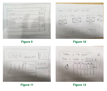
In Figures 9-12, we came up with several different variations of the results page, showing the user where the product is located and comparing the prices of products. In Figure 9, the interface would display a list of different specific items that the user could choose from based on the category that was asked. In Figure 10, different brands and pictures, along with their prices would be shown to the user so they could compare the products. Figure 11 shows a map of the store, addressing the location of the user and the location of the product, as well as the price of the product. Figure 12 also shows a map and indicates what the user asked and what the interface responds with. We decided that comparing prices and products is not part of the problem we are trying to solve, so we decided to exclude that feature from our prototype. We agreed that a map on the interface that indicates where the user/kiosk is located currently and where the product is located would be beneficial for the user to figure out which path they should take to obtain the product. While it may not be able to specify which shelf level the product is on, we agreed that the interface should definitely indicate which aisle the product is on so the user would be able to recognize the aisle numbers from above.
Feedback & Iteration
Usability Testing
After ideation and sketching, we tested our low-fidelity prototype with two college students. The goal is to see if any part of “Sophie” may cause confusion to the users. A few issues we noted during testing:
Overall, our grocery store virtual assistant tested well among users. All of our users enjoyed their experience with the assistant and claimed that they would use it in a grocery store. They enjoyed the simplicity of the design and how straight-forward it was. They claimed they didn’t find anything confusing, however, some of the tasks and signifiers weren’t understood to their original intents. We received some interesting suggestions on what else we could include in our designs, and discussed amongst ourselves if these suggestions would be beneficial towards our problem or would address a different problem.
Two out of three of our users understood the purpose of the microphone, while one ignored it and went straight to typing without recognizing it. To indicate that the user should press the microphone and speak to the system, we decided to add the phrase “tap to speak” beneath the microphone icon to our updated prototype. One user also suggested the addition of popular search suggestions for the user to be able to tap on if they are looking for the same item, rather than speaking or typing their question. We decided that this would improve efficiency with our design and incorporated it into our updated prototype.
There was nothing confusing about our listening page to our users, so we decided to keep it as is.
For our results page, one of our users thought he was able to click on “Aisle 8” to see more. We decided that to prevent this from happening, we would eliminate the green, underlined text, and instead bold the term to make it seem less clickable. One user also suggested the addition of a pathway from the current location to the location of the pasta that he can take. We decided to include this suggestion because it could better improve the user’s navigation and know the most efficient path for where to get their product.
Iteration
After receiving feedback from potential users and our peers from usability testing, we gathered as a team and discussed where we wanted to move forward. .
Below are some of the alternatives we came up with
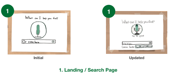
Our first changes were to our landing/search page. Our biggest update was creating a section for common searches by previous users. This was recommended to us by user 1, and the goal is to allow quicker searches to commonly searched items. This will work by using an algorithm to track previous searches and compile a consistently updated list with the most popular items. Alongside this we added a signifier below the microphone button indicating the user to tap to speak to the interface. This will help the user better understand what to do on the screen.

The listening page remained unchanged. We did not find any issues with the usability or understanding of this page through testing.
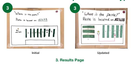
The results page was changed based on the results from our usability test. User 2 viewed the “AISLE 8” as a button and wanted to click it. We did not intend for this to be a clickable button. However, we just wanted to emphasize the aisle number. Therefore, in our updated prototype, we removed the color and underline from “AISLE 8” and just bolded the text. Also, User 3 said that it would be helpful if there was a line connecting where you are and where the item was. Hence, why we added the red path line. Additionally, we changed the layout of the map to look more like a grocery store layout with some horizontal aisles.
Desirability Testing
We decided to use desirability testing on our updated prototype. We felt desirability testing would be best for a grocery shopping technology implementation, because what makes grocery shopping enjoyable is customer experience. Therefore, we wanted to see how testers would react to our product, through using simple adjectives. We believe that we can gage the level of satisfaction from these 24 terms:
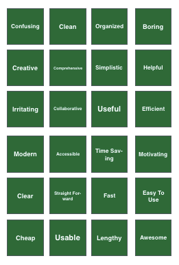
We chose these terms because we felt they best fit our prototype. Additionally, these terms were used in the “Universal Methods of Design” book by Bella Martin & Bruce Hannington.
Results
On Tuesday, March 7, we conducted two desirability tests on our updated prototype. A regular usability test was conducted. Then, our testers were asked to select three adjectives that best described their overall experience.
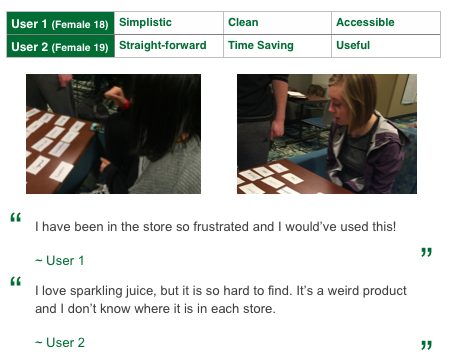
Analysis
From this test, we gained some amazing feedback from our users. In both of our tests, our users were fully able to complete every task. Additionally they both chose only positive adjectives. The chosen words let us know that the product would be very useful in a grocery store context. Additionally, the tests ensured that our solution is quick and time efficient. Additionally, user 2 reassured us that she would use the device to find more obscure items.
Final Solution
Our solution “Sophie” is a grocery store virtual assistant that allows you to ask where any item is located in the store. After asking the question, the device will show you the aisle and map you a path from your current location the item. This allows you to avoid the trouble of locating and asking store employees.
We believe Sophie solves the problem of our users not being able to find obscure items in smaller grocery stores. Additionally, our solution keeps in mind all of the focus areas: target user and economics.
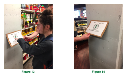
Target User
Our target user is adult women, aged 35-50. Therefore, we designed the implementation to fit that group. According to livestrong.com, the average American woman is 5’4”. Therefore we plan for the Sophie device to be placed at eye level for a 5’4” woman. Team member Delaney Rundell is 5’4”, so we used her for testing as seen in Figure 13. Additionally, these kiosks would be placed on the columns located around Fresh City Market in each section as seen in Figure 14.
Economics
From the beginning, we knew we could not cost the store any profit. We believe that Sophie will not only be cost efficient implement, but it will increase revenue over time. We believe that implementation of a helpful device will encourage customers to come to a store. They will be interested in using new technology. As stated earlier in the document, Nuance released a survey in 2015 that stated, “60% of survey respondents said they would use a conversational interface for mobile app self-service if their bank, retailer, insurance company or other service provider offered it”. We believe that customers satisfaction will increase, as they can easily find the more obscure items on their list. Additionally, it will increase profit for the store, because less employees need to be on the floor to answer questions and more employees can do more productive tasks.
